添加404页面
📖 阅读信息
阅读时间:1 分钟 | 中文字符:131 | 有效代码行数:29
首先在mkdocs.yml文件中添加custom_dir:
docs/overrides文件下新建404.html
树状结构如下:
$ tree -a
.
├── .github
│   ├── .DS_Store
│   └── workflows
│       └── ci.yml
├── docs
│   └── index.md
│   └──overrides
│       └──assets
│       └──404.html
│       └──partials
│          └──comments.html
│
└── mkdocs.yml
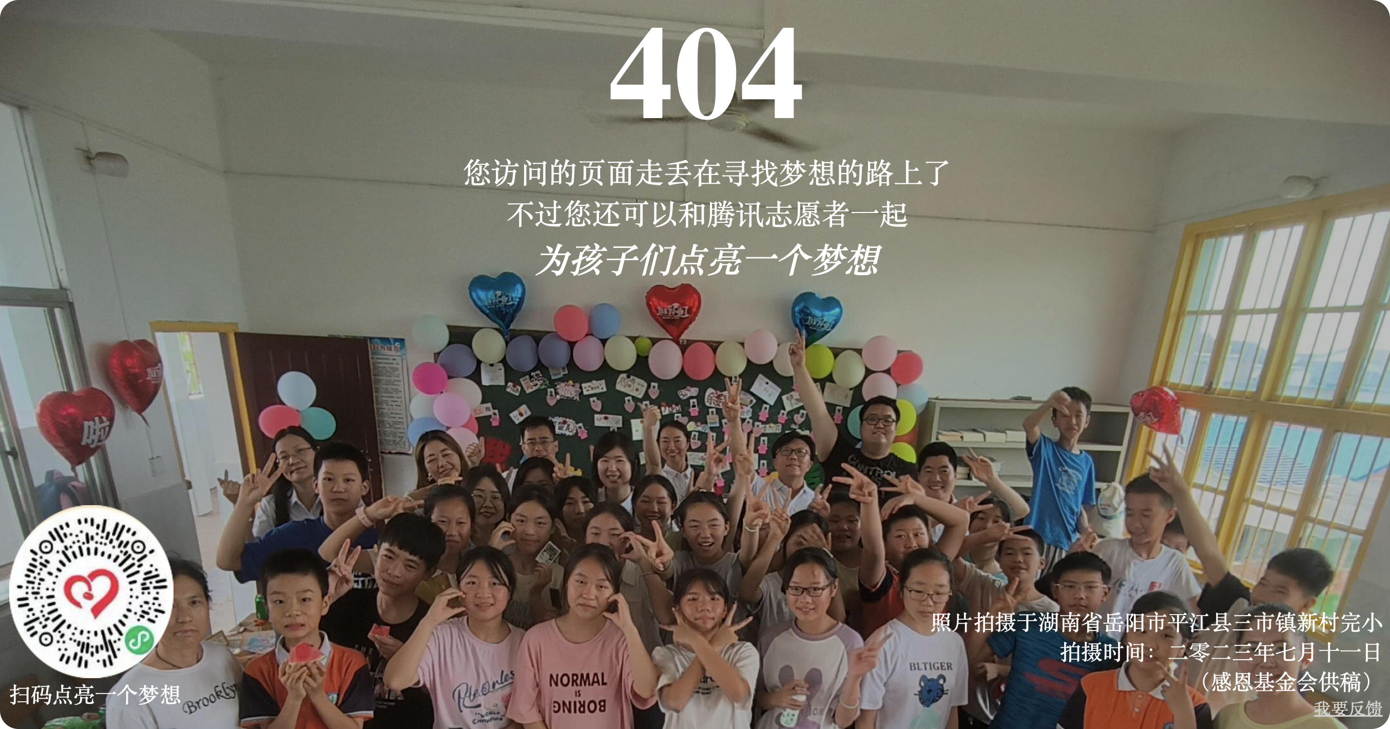
404公益页面
点击展开
<!DOCTYPE html>
<html lang="zh-CN">
  <head>
    <meta charset="UTF-8" />
    <meta name="viewport" content="width=device-width, initial-scale=1.0" />
    <title>404 - 页面不存在</title>```
<!DOCTYPE html>
<html lang="zh-cn">
<head>
    <meta charset="UTF-8" />
    <meta name="description" content="公益404页面是由腾讯公司员工志愿者自主发起的互联网公益活动。" />
    <link rel="icon" href="data:image/gif;base64,R0lGODdhIAAgANUAAAAAAAgFBgYICAwMDBAPDxAQDxQTFBUYFxcaGRwcHCQkJCQoJykqKTQ0ND09PUJCQktMTFZWVltcXF1hYGNjY2doaGpqanNzc3d5eHp6eoODg4uLi5eXl5mamqOjo62tra+wr7S0tLe5uLu7u7/AwMPEw83NzdbX1tfa2dra2uTk5Ovr6+/w7/T09Pj39/f4+P///wAAAAAAAAAAAAAAAAAAAAAAAAAAAAAAAAAAAAAAAAAAAAAAAAAAAAAAAAAAACH5BAkAADEALAAAAAAgACAAAAb/QJhwOGyZOpIGQ6FgNCQcU4tIrcJaIwlgy+1uJaOplZqydBOSzGaTkSS6lNN4ONoOAJRQajV0rVAgFF0jcyEAbw9hc1cjD4cAIVZ1DAAXKotEKxkAlIREJ48bYphFGwAKAHJCLWaVo6RFF1sWYnUDDpewVSoOd4QtWgCeMCmXLaqfUyopdF9GWxRiKQAVKh3CRHUdKhQEzFeCAEdbH6uOh28A3ypbCQhbEGIfWx2CCd8wJhB2CpFDIQvuAIBgYkiKN0kASOAzRJYjBwyFrGgAwNGFTFqUAMjwYogpA1woMFwRDgDIDUQ2LQGAcoiGLRr2QRgp8yUADURMMWFJRYMH3BglJOQSwq0EDA84c56ilOGVLisqKUaISKVFihIjRJRI4XTIiggAGggygKxICAoguSDI0/UEyAnXAJTLJMtLlwxUYcwD0MEEtIgtBKGi0OHDh3qn8IwKvEVKuGHXGAwI8apFCAOUOvxzBqNOAVzgthi1UgKasl7YrtS9MMXI6DEjpKieNWoaSA1dF7V4+QafkNKoLOlSIQsVCUkmATgYwWIRCxEOAByANKc0AAEAJnzYI6bFihQfBAUQjSlF3S0GIqjZgCFC2i0XfM/BUtJuSEVPjdRTwsQJYdljBAEAOw==" />
    <title>404 您访问的页面搞丢了</title>
    <script src="https://volunteer.cdn-go.cn/404/latest/404.js" rendertarget="404DlV"></script>
    <style>
        body {
            overflow-x: hidden;
            max-width: 100vw;
            margin: 0;
            padding: 0;
            background-color: rgba(0, 0, 0, 0);
            color: white;
            text-align: center;
        }
        .container {
            position: relative;
            left: 50%;
            transform: translateX(-50%);
            width: 100%;
            max-width: 1600px;
            height: 100vh;
            display: flex;
            flex-direction: column;
            justify-content: center;
            align-items: center;
        }
        .background-img {
            width: 100%;
            max-width: 1600px;
            filter: brightness(75%);
        }
        .content {
            position: absolute;
            top: 50%;
            transform: translateY(-50%);
            width: 98vw;
            max-width: 1600px;
            text-align: center;
        }
        .content h1 {
            font-size: 128px;
            font-weight: 800;
            margin: 0;
        }
        .content p {
            font-size: 28px;
            margin: 0;
        }
        .content i {
            font-size: 1.2em;
        }
        .footer {
            display: flex;
            justify-content: space-between;
            align-items: center;
            width: 98vw;
            max-width: 1600px;
            font-size: 0.75em;
            margin-top: 20px;
        }
        .footer img {
            width: 160px;
        }
        .footer div {
            text-align: right;
        }
        .footer a {
            /* color: lightgray; */
            font-size: 0.8em;
        }
    </style>
</head>
<body>
    <div class="container">
        <img class="background-img" alt="404!您要访问的页面走丢了!" src="https://volunteer.cdn-go.cn/404/latest/img/dream4school.jpg" />
        <div class="content">
            <h1>404 NOT Found</h1>
            <p>您访问的页面走丢在寻找梦想的路上了</p>
            <p>不过您还可以和腾讯志愿者一起</p>
            <i><b>为孩子们点亮一个梦想</b></i>
        </div>
        <div class="footer">
            <a href="https://volunteer.cdn-go.cn/404/latest/img/dream4schoolQR.png">
                <img src="https://volunteer.cdn-go.cn/404/latest/img/dream4schoolQR.png" alt="点击进入支持页面" />
                <br />扫码点亮一个梦想
            </a>
            <div>
                <p>照片拍摄于湖南省岳阳市平江县三市镇新村完小</p>
                <p>拍摄时间:二零二三年七月十一日</p>
                <p>(感恩基金会供稿)</p>
                <a href="https://support.qq.com/products/378306">我要反馈</a>
            </div>
        </div>
    </div>
</body>
</html>
404骰子页面
目前更换了新的404页面:
点击展开
<!DOCTYPE html>
<html>
  <head>
    <meta charset="utf-8" />
    <title>404</title>
    <style>
      body {
        background: #000;
        height: 100vh;
        overflow: hidden;
        display: flex;
        font-family: Anton, sans-serif;
        justify-content: center;
        align-items: center;
        -webkit-perspective: 1000px;
        perspective: 1000px;
      }

      div {
        -webkit-transform-style: preserve-3d;
        transform-style: preserve-3d;
      }

      .rail {
        position: absolute;
        width: 100%;
        height: 100%;
        display: flex;
        justify-content: center;
        align-items: center;
        -webkit-transform: rotateX(-30deg) rotateY(-30deg);
        transform: rotateX(-30deg) rotateY(-30deg);
      }

      .rail .stamp {
        position: absolute;
        width: 200px;
        height: 200px;
        display: flex;
        justify-content: center;
        align-items: center;
        background: #141414;
        color: #fff;
        font-size: 7rem;
      }

      .rail .stamp:nth-child(1) {
        -webkit-animation: stampSlide 40s -2.3s linear infinite;
        animation: stampSlide 40s -2.3s linear infinite;
      }

      .rail .stamp:nth-child(2) {
        -webkit-animation: stampSlide 40s -4.3s linear infinite;
        animation: stampSlide 40s -4.3s linear infinite;
      }

      .rail .stamp:nth-child(3) {
        -webkit-animation: stampSlide 40s -6.3s linear infinite;
        animation: stampSlide 40s -6.3s linear infinite;
      }

      .rail .stamp:nth-child(4) {
        -webkit-animation: stampSlide 40s -8.3s linear infinite;
        animation: stampSlide 40s -8.3s linear infinite;
      }

      .rail .stamp:nth-child(5) {
        -webkit-animation: stampSlide 40s -10.3s linear infinite;
        animation: stampSlide 40s -10.3s linear infinite;
      }

      .rail .stamp:nth-child(6) {
        -webkit-animation: stampSlide 40s -12.3s linear infinite;
        animation: stampSlide 40s -12.3s linear infinite;
      }

      .rail .stamp:nth-child(7) {
        -webkit-animation: stampSlide 40s -14.3s linear infinite;
        animation: stampSlide 40s -14.3s linear infinite;
      }

      .rail .stamp:nth-child(8) {
        -webkit-animation: stampSlide 40s -16.3s linear infinite;
        animation: stampSlide 40s -16.3s linear infinite;
      }

      .rail .stamp:nth-child(9) {
        -webkit-animation: stampSlide 40s -18.3s linear infinite;
        animation: stampSlide 40s -18.3s linear infinite;
      }

      .rail .stamp:nth-child(10) {
        -webkit-animation: stampSlide 40s -20.3s linear infinite;
        animation: stampSlide 40s -20.3s linear infinite;
      }

      .rail .stamp:nth-child(11) {
        -webkit-animation: stampSlide 40s -22.3s linear infinite;
        animation: stampSlide 40s -22.3s linear infinite;
      }

      .rail .stamp:nth-child(12) {
        -webkit-animation: stampSlide 40s -24.3s linear infinite;
        animation: stampSlide 40s -24.3s linear infinite;
      }

      .rail .stamp:nth-child(13) {
        -webkit-animation: stampSlide 40s -26.3s linear infinite;
        animation: stampSlide 40s -26.3s linear infinite;
      }

      .rail .stamp:nth-child(14) {
        -webkit-animation: stampSlide 40s -28.3s linear infinite;
        animation: stampSlide 40s -28.3s linear infinite;
      }

      .rail .stamp:nth-child(15) {
        -webkit-animation: stampSlide 40s -30.3s linear infinite;
        animation: stampSlide 40s -30.3s linear infinite;
      }

      .rail .stamp:nth-child(16) {
        -webkit-animation: stampSlide 40s -32.3s linear infinite;
        animation: stampSlide 40s -32.3s linear infinite;
      }

      .rail .stamp:nth-child(17) {
        -webkit-animation: stampSlide 40s -34.3s linear infinite;
        animation: stampSlide 40s -34.3s linear infinite;
      }

      .rail .stamp:nth-child(18) {
        -webkit-animation: stampSlide 40s -36.3s linear infinite;
        animation: stampSlide 40s -36.3s linear infinite;
      }

      .rail .stamp:nth-child(19) {
        -webkit-animation: stampSlide 40s -38.3s linear infinite;
        animation: stampSlide 40s -38.3s linear infinite;
      }

      .rail .stamp:nth-child(20) {
        -webkit-animation: stampSlide 40s -40.3s linear infinite;
        animation: stampSlide 40s -40.3s linear infinite;
      }

      @-webkit-keyframes stampSlide {
        0% {
          -webkit-transform: rotateX(90deg) rotateZ(-90deg) translateZ(-200px)
            translateY(130px);
          transform: rotateX(90deg) rotateZ(-90deg) translateZ(-200px)
            translateY(130px);
        }

        100% {
          -webkit-transform: rotateX(90deg) rotateZ(-90deg) translateZ(-200px)
            translateY(-3870px);
          transform: rotateX(90deg) rotateZ(-90deg) translateZ(-200px)
            translateY(-3870px);
        }
      }

      @keyframes stampSlide {
        0% {
          -webkit-transform: rotateX(90deg) rotateZ(-90deg) translateZ(-200px)
            translateY(130px);
          transform: rotateX(90deg) rotateZ(-90deg) translateZ(-200px)
            translateY(130px);
        }

        100% {
          -webkit-transform: rotateX(90deg) rotateZ(-90deg) translateZ(-200px)
            translateY(-3870px);
          transform: rotateX(90deg) rotateZ(-90deg) translateZ(-200px)
            translateY(-3870px);
        }
      }

      .world {
        -webkit-transform: rotateX(-30deg) rotateY(-30deg);
        transform: rotateX(-30deg) rotateY(-30deg);
      }

      .world .forward {
        position: absolute;
        -webkit-animation: slide 2s linear infinite;
        animation: slide 2s linear infinite;
      }

      .world .box {
        width: 200px;
        height: 200px;
        -webkit-transform-origin: 100% 100%;
        transform-origin: 100% 100%;
        -webkit-animation: roll 2s cubic-bezier(1, 0.01, 1, 1) infinite;
        animation: roll 2s cubic-bezier(1, 0.01, 1, 1) infinite;
      }

      .world .box .wall {
        position: absolute;
        width: 200px;
        height: 200px;
        background: rgba(10, 10, 10, 0.8);
        border: 1px solid #fafafa;
        box-sizing: border-box;
      }

      .world .box .wall::before {
        content: "";
        position: absolute;
        width: 100%;
        height: 100%;
        display: flex;
        justify-content: center;
        align-items: center;
        color: #fff;
        font-size: 7rem;
      }

      .world .box .wall:nth-child(1) {
        -webkit-transform: translateZ(100px);
        transform: translateZ(100px);
      }

      .world .box .wall:nth-child(2) {
        -webkit-transform: rotateX(180deg) translateZ(100px);
        transform: rotateX(180deg) translateZ(100px);
      }

      .world .box .wall:nth-child(3) {
        -webkit-transform: rotateX(90deg) translateZ(100px);
        transform: rotateX(90deg) translateZ(100px);
      }

      .world .box .wall:nth-child(3)::before {
        -webkit-transform: rotateX(180deg) rotateZ(90deg) translateZ(-1px);
        transform: rotateX(180deg) rotateZ(90deg) translateZ(-1px);
        -webkit-animation: zeroFour 4s -2s linear infinite;
        animation: zeroFour 4s -2s linear infinite;
      }

      .world .box .wall:nth-child(4) {
        -webkit-transform: rotateX(-90deg) translateZ(100px);
        transform: rotateX(-90deg) translateZ(100px);
      }

      .world .box .wall:nth-child(4)::before {
        -webkit-transform: rotateX(180deg) rotateZ(-90deg) translateZ(-1px);
        transform: rotateX(180deg) rotateZ(-90deg) translateZ(-1px);
        -webkit-animation: zeroFour 4s -2s linear infinite;
        animation: zeroFour 4s -2s linear infinite;
      }

      .world .box .wall:nth-child(5) {
        -webkit-transform: rotateY(90deg) translateZ(100px);
        transform: rotateY(90deg) translateZ(100px);
      }

      .world .box .wall:nth-child(5)::before {
        -webkit-transform: rotateX(180deg) translateZ(-1px);
        transform: rotateX(180deg) translateZ(-1px);
        -webkit-animation: zeroFour 4s linear infinite;
        animation: zeroFour 4s linear infinite;
      }

      .world .box .wall:nth-child(6) {
        -webkit-transform: rotateY(-90deg) translateZ(100px);
        transform: rotateY(-90deg) translateZ(100px);
      }

      .world .box .wall:nth-child(6)::before {
        -webkit-transform: rotateX(180deg) rotateZ(180deg) translateZ(-1px);
        transform: rotateX(180deg) rotateZ(180deg) translateZ(-1px);
        -webkit-animation: zeroFour 4s linear infinite;
        animation: zeroFour 4s linear infinite;
      }

      @-webkit-keyframes zeroFour {
        0% {
          content: "4";
        }

        100% {
          content: "0";
        }
      }

      @keyframes zeroFour {
        0% {
          content: "4";
        }

        100% {
          content: "0";
        }
      }

      @-webkit-keyframes roll {
        0% {
          -webkit-transform: rotateZ(0);
          transform: rotateZ(0);
        }

        85% {
          -webkit-transform: rotateZ(90deg);
          transform: rotateZ(90deg);
        }

        87% {
          -webkit-transform: rotateZ(88deg);
          transform: rotateZ(88deg);
        }

        90% {
          -webkit-transform: rotateZ(90deg);
          transform: rotateZ(90deg);
        }

        100% {
          -webkit-transform: rotateZ(90deg);
          transform: rotateZ(90deg);
        }
      }

      @keyframes roll {
        0% {
          -webkit-transform: rotateZ(0);
          transform: rotateZ(0);
        }

        85% {
          -webkit-transform: rotateZ(90deg);
          transform: rotateZ(90deg);
        }

        87% {
          -webkit-transform: rotateZ(88deg);
          transform: rotateZ(88deg);
        }

        90% {
          -webkit-transform: rotateZ(90deg);
          transform: rotateZ(90deg);
        }

        100% {
          -webkit-transform: rotateZ(90deg);
          transform: rotateZ(90deg);
        }
      }

      @-webkit-keyframes slide {
        0% {
          -webkit-transform: translateX(0);
          transform: translateX(0);
        }

        100% {
          -webkit-transform: translateX(-200px);
          transform: translateX(-200px);
        }
      }

      @keyframes slide {
        0% {
          -webkit-transform: translateX(0);
          transform: translateX(0);
        }

        100% {
          -webkit-transform: translateX(-200px);
          transform: translateX(-200px);
        }
      }
    </style>
  </head>
  <body>
    <div class="rail">
      <div class="stamp four">4</div>
      <div class="stamp zero">0</div>
      <div class="stamp four">4</div>
      <div class="stamp zero">0</div>
      <div class="stamp four">4</div>
      <div class="stamp zero">0</div>
      <div class="stamp four">4</div>
      <div class="stamp zero">0</div>
      <div class="stamp four">4</div>
      <div class="stamp zero">0</div>
      <div class="stamp four">4</div>
      <div class="stamp zero">0</div>
      <div class="stamp four">4</div>
      <div class="stamp zero">0</div>
      <div class="stamp four">4</div>
      <div class="stamp zero">0</div>
      <div class="stamp four">4</div>
      <div class="stamp zero">0</div>
      <div class="stamp four">4</div>
      <div class="stamp zero">0</div>
    </div>
    <div class="world">
      <div class="forward">
        <div class="box">
          <div class="wall"></div>
          <div class="wall"></div>
          <div class="wall"></div>
          <div class="wall"></div>
          <div class="wall"></div>
          <div class="wall"></div>
        </div>
      </div>
    </div>
  </body>
</html>
💬 评论
评论系统加载中...