404页面
404公益页面
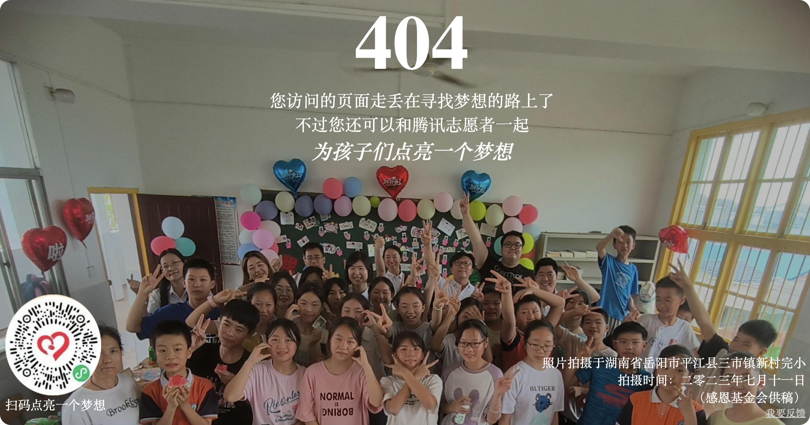
自从2012年12月13号早上,腾讯404公益页面上线以来,多年来我们一直在做寻亲信息投放。但是随着整个社会对于寻亲事业的关注,和公安部门对于人口拐卖犯罪的打击,这些年
来人口拐卖发生的越来越少,随着天眼等社会安全系统等普及,人口失踪的发生也越来越少,失踪时间也越来越短,到现在,404公益继续进行寻亲信息投放的意义已经越来越小了。
因此,今年我们要对404公益项目做一些转型,利用404页面资源投放一些对当前的社会更有意义的公益信息,比如环保、救灾、避险等等。
为了社会公益事业,我也接入了公益页面:
愿天下无拐!公益之花不断!
404骰子页面
目前更换了新的404页面:
404骰子页面
  1
  2
  3
  4
  5
  6
  7
  8
  9
 10
 11
 12
 13
 14
 15
 16
 17
 18
 19
 20
 21
 22
 23
 24
 25
 26
 27
 28
 29
 30
 31
 32
 33
 34
 35
 36
 37
 38
 39
 40
 41
 42
 43
 44
 45
 46
 47
 48
 49
 50
 51
 52
 53
 54
 55
 56
 57
 58
 59
 60
 61
 62
 63
 64
 65
 66
 67
 68
 69
 70
 71
 72
 73
 74
 75
 76
 77
 78
 79
 80
 81
 82
 83
 84
 85
 86
 87
 88
 89
 90
 91
 92
 93
 94
 95
 96
 97
 98
 99
100
101
102
103
104
105
106
107
108
109
110
111
112
113
114
115
116
117
118
119
120
121
122
123
124
125
126
127
128
129
130
131
132
133
134
135
136
137
138
139
140
141
142
143
144
145
146
147
148
149
150
151
152
153
154
155
156
157
158
159
160
161
162
163
164
165
166
167
168
169
170
171
172
173
174
175
176
177
178
179
180
181
182
183
184
185
186
187
188
189
190
191
192
193
194
195
196
197
198
199
200
201
202
203
204
205
206
207
208
209
210
211
212
213
214
215
216
217
218
219
220
221
222
223
224
225
226
227
228
229
230
231
232
233
234
235
236
237
238
239
240
241
242
243
244
245
246
247
248
249
250
251
252
253
254
255
256
257
258
259
260
261
262
263
264
265
266
267
268
269
270
271
272
273
274
275
276
277
278
279
280
281
282
283
284
285
286
287
288
289
290
291
292
293
294
295
296
297
298
299
300
301
302
303
304
305
306
307
308
309
310
311
312
313
314
315
316
317
318
319
320
321
322
323
324
325
326
327
328
329
330
331
332
333
334
335
336
337
338
339
340
341
342
343
344
345
346
347
348
349
350
351
352
353
354
355
356
357
358
359
360
361
362
363
364
365
366
367
368
369
370
371
372
373
374
375
376
377
378
379
380
381
382
383
384
385
386
387
388
389
390
391
392
393
394
395
396
397
398
399
400
401
402
403
404
405
406
407
408
409
410
411
412
413 | <!DOCTYPE html>
<html>
<head>
<meta charset="utf-8" />
<title>404</title>
<style>
body {
background: #000;
height: 100vh;
overflow: hidden;
display: flex;
font-family: Anton, sans-serif;
justify-content: center;
align-items: center;
-webkit-perspective: 1000px;
perspective: 1000px;
}
div {
-webkit-transform-style: preserve-3d;
transform-style: preserve-3d;
}
.rail {
position: absolute;
width: 100%;
height: 100%;
display: flex;
justify-content: center;
align-items: center;
-webkit-transform: rotateX(-30deg) rotateY(-30deg);
transform: rotateX(-30deg) rotateY(-30deg);
}
.rail .stamp {
position: absolute;
width: 200px;
height: 200px;
display: flex;
justify-content: center;
align-items: center;
background: #141414;
color: #fff;
font-size: 7rem;
}
.rail .stamp:nth-child(1) {
-webkit-animation: stampSlide 40s -2.3s linear infinite;
animation: stampSlide 40s -2.3s linear infinite;
}
.rail .stamp:nth-child(2) {
-webkit-animation: stampSlide 40s -4.3s linear infinite;
animation: stampSlide 40s -4.3s linear infinite;
}
.rail .stamp:nth-child(3) {
-webkit-animation: stampSlide 40s -6.3s linear infinite;
animation: stampSlide 40s -6.3s linear infinite;
}
.rail .stamp:nth-child(4) {
-webkit-animation: stampSlide 40s -8.3s linear infinite;
animation: stampSlide 40s -8.3s linear infinite;
}
.rail .stamp:nth-child(5) {
-webkit-animation: stampSlide 40s -10.3s linear infinite;
animation: stampSlide 40s -10.3s linear infinite;
}
.rail .stamp:nth-child(6) {
-webkit-animation: stampSlide 40s -12.3s linear infinite;
animation: stampSlide 40s -12.3s linear infinite;
}
.rail .stamp:nth-child(7) {
-webkit-animation: stampSlide 40s -14.3s linear infinite;
animation: stampSlide 40s -14.3s linear infinite;
}
.rail .stamp:nth-child(8) {
-webkit-animation: stampSlide 40s -16.3s linear infinite;
animation: stampSlide 40s -16.3s linear infinite;
}
.rail .stamp:nth-child(9) {
-webkit-animation: stampSlide 40s -18.3s linear infinite;
animation: stampSlide 40s -18.3s linear infinite;
}
.rail .stamp:nth-child(10) {
-webkit-animation: stampSlide 40s -20.3s linear infinite;
animation: stampSlide 40s -20.3s linear infinite;
}
.rail .stamp:nth-child(11) {
-webkit-animation: stampSlide 40s -22.3s linear infinite;
animation: stampSlide 40s -22.3s linear infinite;
}
.rail .stamp:nth-child(12) {
-webkit-animation: stampSlide 40s -24.3s linear infinite;
animation: stampSlide 40s -24.3s linear infinite;
}
.rail .stamp:nth-child(13) {
-webkit-animation: stampSlide 40s -26.3s linear infinite;
animation: stampSlide 40s -26.3s linear infinite;
}
.rail .stamp:nth-child(14) {
-webkit-animation: stampSlide 40s -28.3s linear infinite;
animation: stampSlide 40s -28.3s linear infinite;
}
.rail .stamp:nth-child(15) {
-webkit-animation: stampSlide 40s -30.3s linear infinite;
animation: stampSlide 40s -30.3s linear infinite;
}
.rail .stamp:nth-child(16) {
-webkit-animation: stampSlide 40s -32.3s linear infinite;
animation: stampSlide 40s -32.3s linear infinite;
}
.rail .stamp:nth-child(17) {
-webkit-animation: stampSlide 40s -34.3s linear infinite;
animation: stampSlide 40s -34.3s linear infinite;
}
.rail .stamp:nth-child(18) {
-webkit-animation: stampSlide 40s -36.3s linear infinite;
animation: stampSlide 40s -36.3s linear infinite;
}
.rail .stamp:nth-child(19) {
-webkit-animation: stampSlide 40s -38.3s linear infinite;
animation: stampSlide 40s -38.3s linear infinite;
}
.rail .stamp:nth-child(20) {
-webkit-animation: stampSlide 40s -40.3s linear infinite;
animation: stampSlide 40s -40.3s linear infinite;
}
@-webkit-keyframes stampSlide {
0% {
-webkit-transform: rotateX(90deg) rotateZ(-90deg) translateZ(-200px)
translateY(130px);
transform: rotateX(90deg) rotateZ(-90deg) translateZ(-200px)
translateY(130px);
}
100% {
-webkit-transform: rotateX(90deg) rotateZ(-90deg) translateZ(-200px)
translateY(-3870px);
transform: rotateX(90deg) rotateZ(-90deg) translateZ(-200px)
translateY(-3870px);
}
}
@keyframes stampSlide {
0% {
-webkit-transform: rotateX(90deg) rotateZ(-90deg) translateZ(-200px)
translateY(130px);
transform: rotateX(90deg) rotateZ(-90deg) translateZ(-200px)
translateY(130px);
}
100% {
-webkit-transform: rotateX(90deg) rotateZ(-90deg) translateZ(-200px)
translateY(-3870px);
transform: rotateX(90deg) rotateZ(-90deg) translateZ(-200px)
translateY(-3870px);
}
}
.world {
-webkit-transform: rotateX(-30deg) rotateY(-30deg);
transform: rotateX(-30deg) rotateY(-30deg);
}
.world .forward {
position: absolute;
-webkit-animation: slide 2s linear infinite;
animation: slide 2s linear infinite;
}
.world .box {
width: 200px;
height: 200px;
-webkit-transform-origin: 100% 100%;
transform-origin: 100% 100%;
-webkit-animation: roll 2s cubic-bezier(1, 0.01, 1, 1) infinite;
animation: roll 2s cubic-bezier(1, 0.01, 1, 1) infinite;
}
.world .box .wall {
position: absolute;
width: 200px;
height: 200px;
background: rgba(10, 10, 10, 0.8);
border: 1px solid #fafafa;
box-sizing: border-box;
}
.world .box .wall::before {
content: "";
position: absolute;
width: 100%;
height: 100%;
display: flex;
justify-content: center;
align-items: center;
color: #fff;
font-size: 7rem;
}
.world .box .wall:nth-child(1) {
-webkit-transform: translateZ(100px);
transform: translateZ(100px);
}
.world .box .wall:nth-child(2) {
-webkit-transform: rotateX(180deg) translateZ(100px);
transform: rotateX(180deg) translateZ(100px);
}
.world .box .wall:nth-child(3) {
-webkit-transform: rotateX(90deg) translateZ(100px);
transform: rotateX(90deg) translateZ(100px);
}
.world .box .wall:nth-child(3)::before {
-webkit-transform: rotateX(180deg) rotateZ(90deg) translateZ(-1px);
transform: rotateX(180deg) rotateZ(90deg) translateZ(-1px);
-webkit-animation: zeroFour 4s -2s linear infinite;
animation: zeroFour 4s -2s linear infinite;
}
.world .box .wall:nth-child(4) {
-webkit-transform: rotateX(-90deg) translateZ(100px);
transform: rotateX(-90deg) translateZ(100px);
}
.world .box .wall:nth-child(4)::before {
-webkit-transform: rotateX(180deg) rotateZ(-90deg) translateZ(-1px);
transform: rotateX(180deg) rotateZ(-90deg) translateZ(-1px);
-webkit-animation: zeroFour 4s -2s linear infinite;
animation: zeroFour 4s -2s linear infinite;
}
.world .box .wall:nth-child(5) {
-webkit-transform: rotateY(90deg) translateZ(100px);
transform: rotateY(90deg) translateZ(100px);
}
.world .box .wall:nth-child(5)::before {
-webkit-transform: rotateX(180deg) translateZ(-1px);
transform: rotateX(180deg) translateZ(-1px);
-webkit-animation: zeroFour 4s linear infinite;
animation: zeroFour 4s linear infinite;
}
.world .box .wall:nth-child(6) {
-webkit-transform: rotateY(-90deg) translateZ(100px);
transform: rotateY(-90deg) translateZ(100px);
}
.world .box .wall:nth-child(6)::before {
-webkit-transform: rotateX(180deg) rotateZ(180deg) translateZ(-1px);
transform: rotateX(180deg) rotateZ(180deg) translateZ(-1px);
-webkit-animation: zeroFour 4s linear infinite;
animation: zeroFour 4s linear infinite;
}
@-webkit-keyframes zeroFour {
0% {
content: "4";
}
100% {
content: "0";
}
}
@keyframes zeroFour {
0% {
content: "4";
}
100% {
content: "0";
}
}
@-webkit-keyframes roll {
0% {
-webkit-transform: rotateZ(0);
transform: rotateZ(0);
}
85% {
-webkit-transform: rotateZ(90deg);
transform: rotateZ(90deg);
}
87% {
-webkit-transform: rotateZ(88deg);
transform: rotateZ(88deg);
}
90% {
-webkit-transform: rotateZ(90deg);
transform: rotateZ(90deg);
}
100% {
-webkit-transform: rotateZ(90deg);
transform: rotateZ(90deg);
}
}
@keyframes roll {
0% {
-webkit-transform: rotateZ(0);
transform: rotateZ(0);
}
85% {
-webkit-transform: rotateZ(90deg);
transform: rotateZ(90deg);
}
87% {
-webkit-transform: rotateZ(88deg);
transform: rotateZ(88deg);
}
90% {
-webkit-transform: rotateZ(90deg);
transform: rotateZ(90deg);
}
100% {
-webkit-transform: rotateZ(90deg);
transform: rotateZ(90deg);
}
}
@-webkit-keyframes slide {
0% {
-webkit-transform: translateX(0);
transform: translateX(0);
}
100% {
-webkit-transform: translateX(-200px);
transform: translateX(-200px);
}
}
@keyframes slide {
0% {
-webkit-transform: translateX(0);
transform: translateX(0);
}
100% {
-webkit-transform: translateX(-200px);
transform: translateX(-200px);
}
}
</style>
</head>
<body>
<div class="rail">
<div class="stamp four">4</div>
<div class="stamp zero">0</div>
<div class="stamp four">4</div>
<div class="stamp zero">0</div>
<div class="stamp four">4</div>
<div class="stamp zero">0</div>
<div class="stamp four">4</div>
<div class="stamp zero">0</div>
<div class="stamp four">4</div>
<div class="stamp zero">0</div>
<div class="stamp four">4</div>
<div class="stamp zero">0</div>
<div class="stamp four">4</div>
<div class="stamp zero">0</div>
<div class="stamp four">4</div>
<div class="stamp zero">0</div>
<div class="stamp four">4</div>
<div class="stamp zero">0</div>
<div class="stamp four">4</div>
<div class="stamp zero">0</div>
</div>
<div class="world">
<div class="forward">
<div class="box">
<div class="wall"></div>
<div class="wall"></div>
<div class="wall"></div>
<div class="wall"></div>
<div class="wall"></div>
<div class="wall"></div>
</div>
</div>
</div>
</body>
</html>
|